

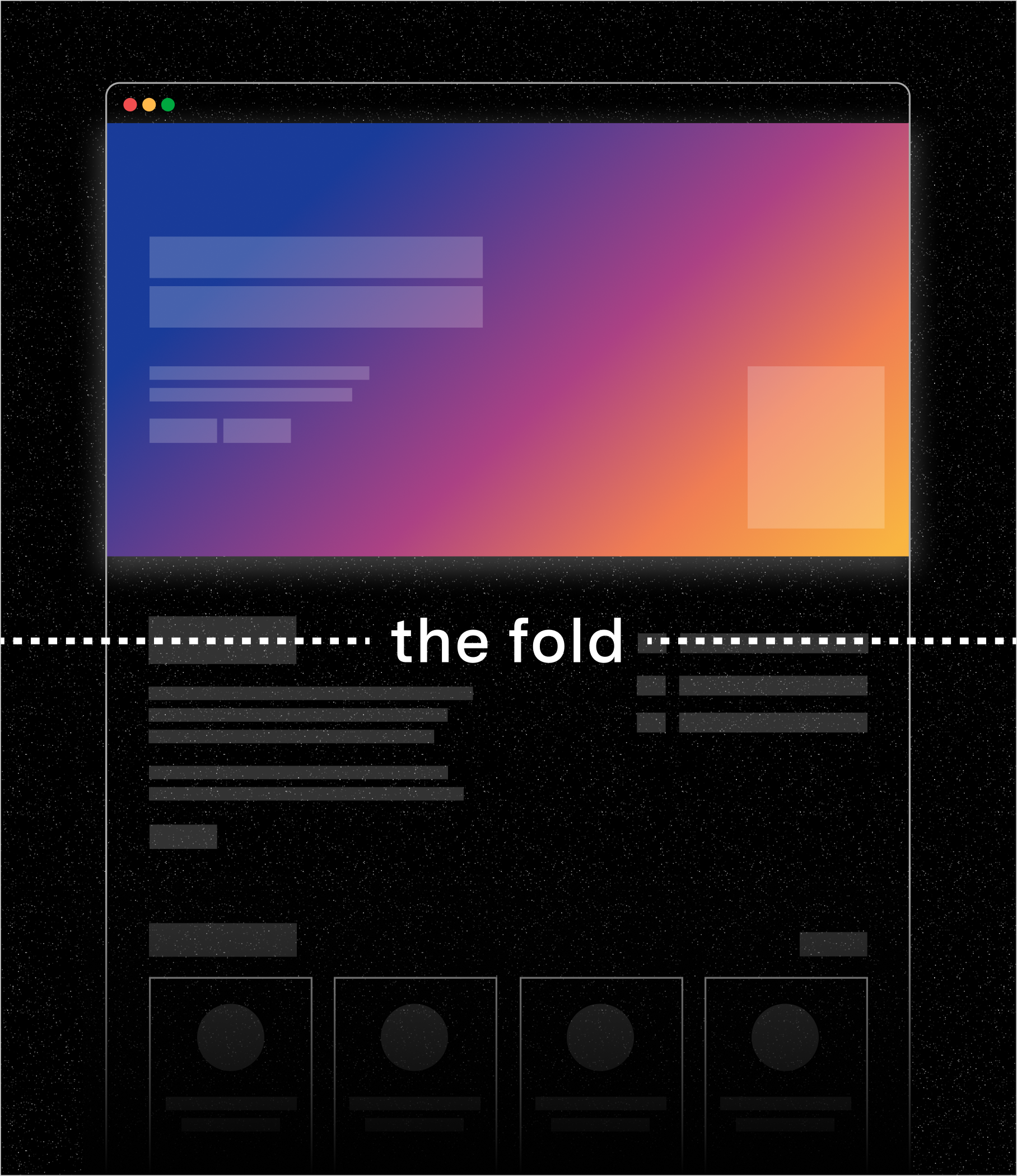
What “above the fold” really means
In web design, “above the fold” refers to the section of a webpage that’s visible before a user scrolls. The phrase originated from print newspapers, where the flashiest, most relevant headlines appeared above the literal fold to capture attention on the newsstand. Online, it refers to the first thing someone sees when they land on a page, sometimes called the first viewport.
For years, “above the fold” carried a set of golden rules of design and content creation: Put the most important information at the top. Make it visible without scrolling. Capture attention immediately.
The assumption was that if people didn’t see it immediately, they might never see it at all. Back then, designers worried that users wouldn’t scroll, but today, scrolling is second nature, especially on mobile. That said, users still need clarity, and they won’t move down a page if the information feels confusing or unfocused at the outset (in fact, there's plenty of evidence suggesting you may have only a few seconds to keep their attention).
So the area above the fold is still the moment of first impression. But if you focus all of your attention on writing/designing for that space alone, you’ll miss the bigger picture. Because when someone lands on a page, they’re trying to understand where they are, whether it matters to them, and what they can do next. In this context, beyond a visual boundary, the fold marks a moment of orientation.
So the real question is not whether above-the-fold design and content matter (they do), but how the entire page is structured to guide focus and support decisions from top to bottom.
That’s where UX and content strategy come in.
Where UX design and content strategy converge
When teams debate what belongs above the fold, they’re usually discussing layout. What do you see in the first viewport? What’s visible before the first scroll?
Within UX design, that first screen does more than display information. It influences whether someone feels grounded or unsure, clear on what to do next, or confused. If the next step or value isn’t crystal clear, hesitation sets in. You lose the scroll.
From a content strategy perspective, the fold forces you to prioritize which messages matter most. Much as we may want to say everything at once, it’s simply not possible. So you have to decide on the leading phrasing and stance and how to support it. And that prioritization determines how the rest of the page unfurls.
Instead of just cramming information above the fold, teams should focus on converging visual and written messaging so the entire experience feels intentional from the moment someone lands there. When UX design and content strategy work together in this way, the first viewport becomes the starting line for a deliberately structured journey.
Structuring experiences from top to bottom
Once the first viewport sets the stage, the rest of the page keeps things moving. Well-built experiences expand sections in order of size or importance with a steady sense of momentum that reduces cognitive load.
Good UX makes it visually conspicuous where to focus, while content strategy reinforces flow by introducing ideas in the order people are ready for them. When visual and written cues reinforce each other, the page scaffolding often looks like this:
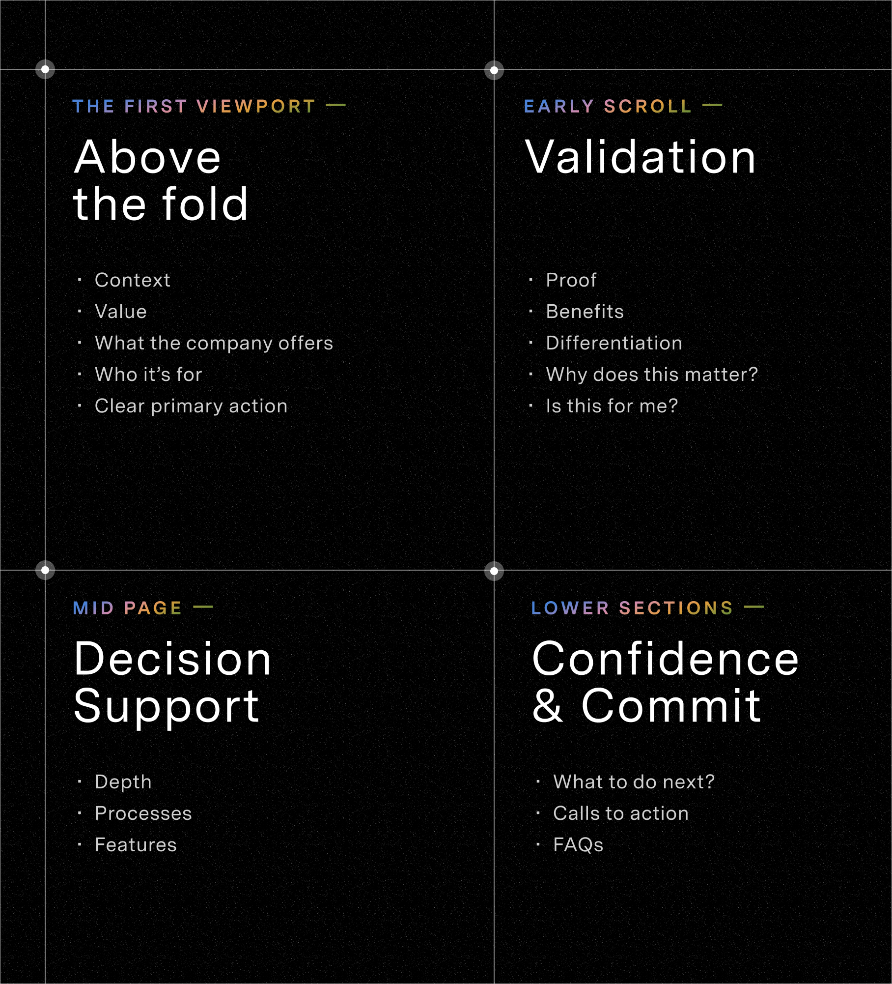
Scrolling tends just to happen when each sequence feels connected to the ones before and after it. Visual and written transitions queue up each new concept with reinforced message priorities, and content depth doesn’t pre-empt visual weight, nor does visual weight pre-empt content depth. Within this sequence, the above-the-fold mark signals the beginning of something deliberate and an opportunity to pique interest.
If you’re a writer by nature, writing for UX can feel counterintuitive. Traditional creative writing relies heavily on tension, layered description, and expressive language to immerse readers. But web users aren’t settling in for a narrative arc; they’re scanning for relevance, evaluating whether it’s worth their time, and deciding whether to keep reading or bounce.
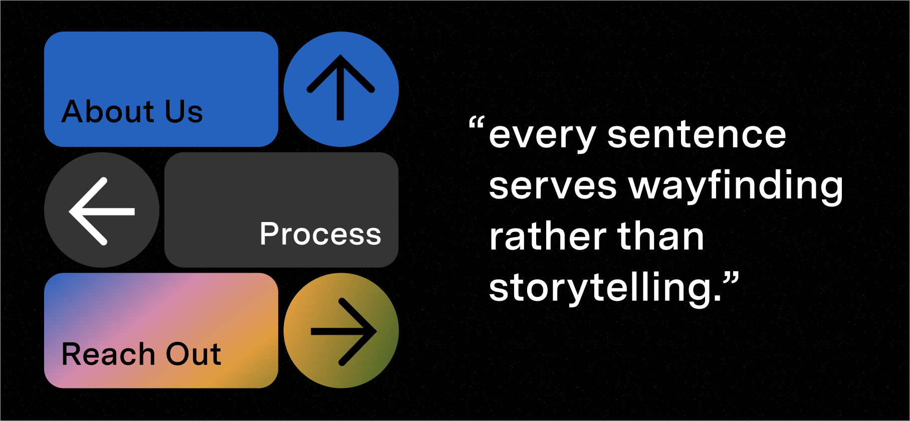
That doesn’t make UX writing less creative. If anything, it demands greater discipline and precision, more sonnet than novel writing. When you write for experience rather than trying to be the experience, every word has a job to do. Every heading guides movement. And every sentence serves wayfinding rather than storytelling.
Beyond the fold
So the long story of it is that what’s above the fold still influences first impressions. It sets the tone and establishes direction, so ignoring it altogether would be shortsighted. However, optimizing a single section of a page will never compensate for an incoherent experience.
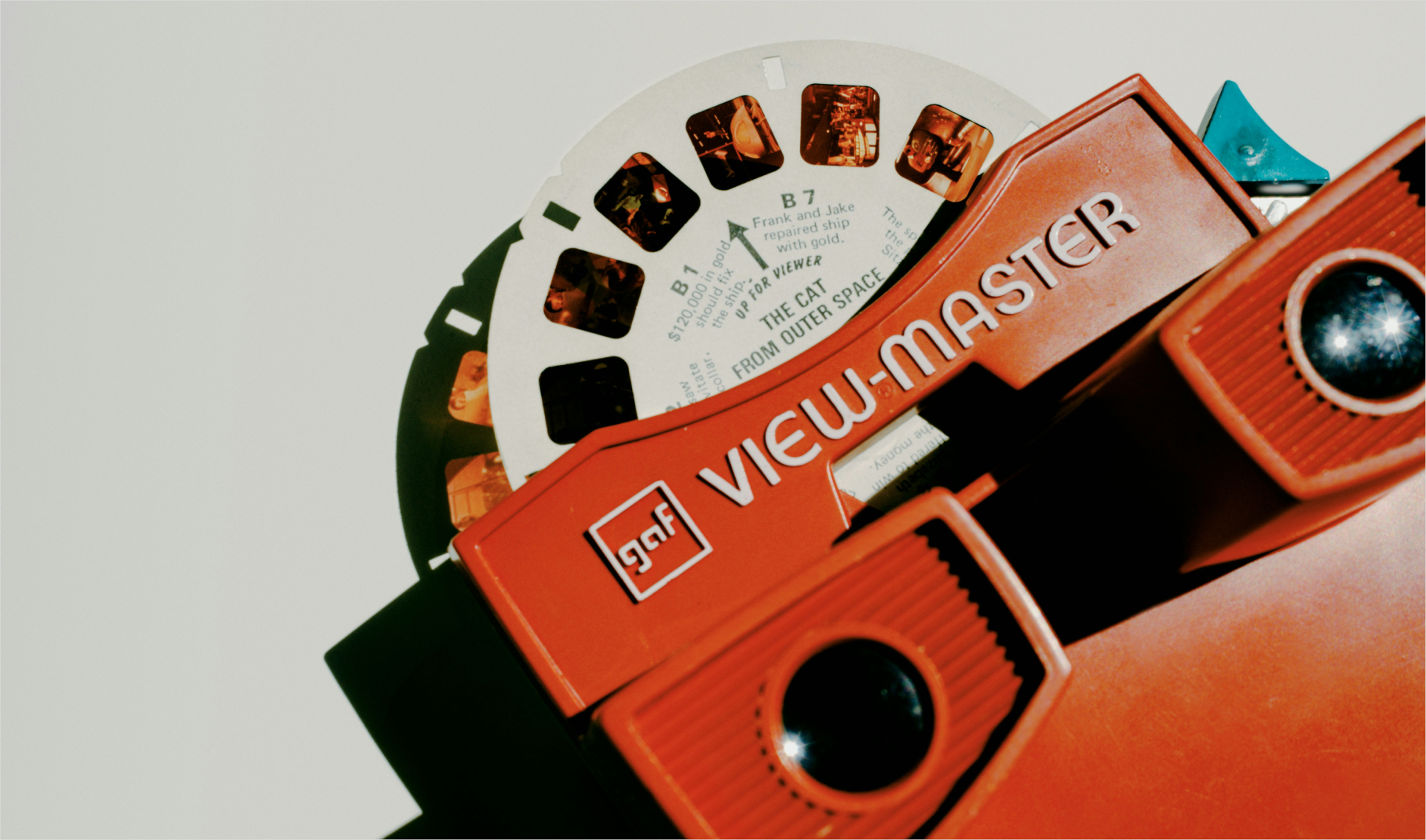
Users don’t click through static shots of websites like a View-Master: they move through them. Each scroll either reinforces clarity or introduces doubt, and each section either builds confidence or creates friction, which is why UX and content sequencing matter more than layout alone.
When UX design and content strategy work in tandem, the space above the fold becomes an entry point rather than a pressure point. Visual hierarchy reinforces content depth, and content depth supports visual flow. The page unfolds with intention rather than urgency. And when the experience feels intentional, users stay, scroll, and act.
So yes, what you design and write above the fold is still important, but designing and writing for flow? That’s essential.


