

Why is your brand’s color palette so important?
To dive into why color is so important, let’s start in the brain. Our brains use our emotions and logic together to make decisions. While both are important, emotions tend to have a greater influence on our actions because they set the priorities and values that logic operates on.
Color can affect our emotions by triggering associations and guiding what we pay attention to. In web design, your brand colors can help users connect with your brand, guide decision-making, and help them understand who your company is.
Selecting colors that represent your brand
Because color creates such powerful emotional connections, it's easy to fall into choosing brand colors based on personal taste. A strong strategy helps balance that instinct, guiding decisions toward a color palette that resonates with users.
Color psychology
It’s helpful to consider color psychology when creating a color palette. Our brains hold connections from the past and already associate colors with certain meanings. Using those established connections can be a powerful tool.
For example, Whole Foods Market uses green as their primary brand color. They use green to represent "freshness," "connection to nature," and "health." When you see the Whole Foods logo, those associations are automatic in your brain.
So green always represents those specific attributes, right? Well, that’s where things get a little tricky. Think about the Monster Energy Drinks. They use green too. But I doubt you connect “nature” and “health” with their brand.
For a while, as a young designer, I was confused on how green could symbolize and convey “health” and “nature” for Whole Foods, while it also conveyed “energy,” “aggression,” and “alternative lifestyle” for Monster.
Color within context
The magic word is ✨context✨. Your brand doesn’t represent itself on color alone. It’s combined with typography and other graphics to create meaning. On the Whole Foods logo, we have a graphic of a leaf, an upscale yet approachable font, and a deep green that evokes green leafy vegetables on a farm.
By comparison, Monster Energy Drink cans feature neon electric green with black contrast, and an “M” that looks like claws slashed through the can, combined with a bold and energetic typeface. These elements converge to make a high-energy brand that reflects exactly who they are.
Use colors that have associations with certain attributes, but keep in mind that the context and design surrounding them will affect how those colors come off to the viewer. Remember that colors are multifaceted and can be shaped in many different ways.

Creating cohesion between your brand colors
You’ve selected some colors. Or maybe you’ve selected a primary color and want to select a couple of secondary colors that combine well. Now, how do you make sure they work well together? A nice place to start is with color harmonies.
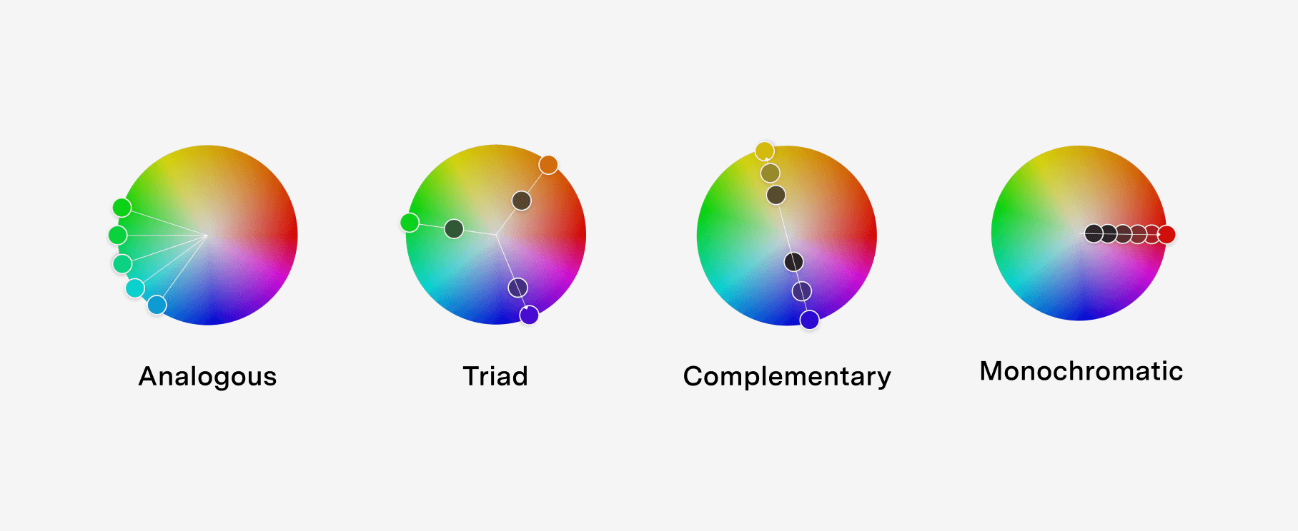
Color harmonies
Colors are often displayed visually in a color wheel, which can be used as a base to build color harmonies. Some of the most common color harmonies are “analogous,” “monochromatic,” “triad,” and “complementary.”
- Analogous: Made by selecting colors next to each other on the color wheel.
- Monochromatic: Using one color with multiple shades of light and dark of the same color.
- Triad: A triangle on the color wheel creates a balanced triad color scheme.
- Complementary: Built on colors completely across from each other on the color wheel.
There are many other color harmonies worth checking out. I like to use the Adobe Color Tool to play with color harmonies in an easy and interactive way. These color harmonies are never hard and fast rules, but are a great starting place to create cohesion between colors.
Color roles
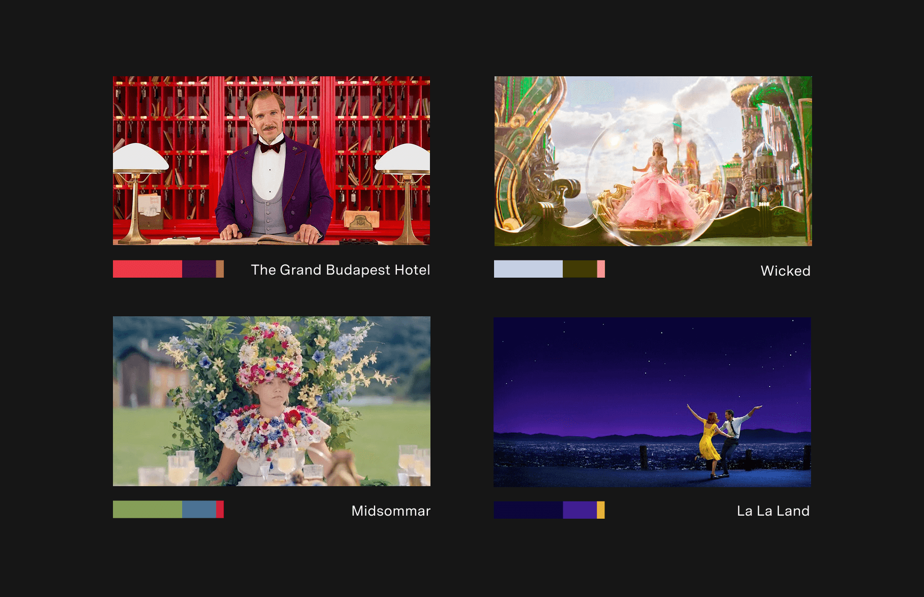
Not all colors should have the same weight. If all of your colors are used at the same level, they start to blend together and become overdone. If you have every color used equally, no color will stand out. Movie producers are familiar with this concept and sometimes use a trick called the “60–30–10 Rule." The “60–30–10 Rule” limits the number of colors in a shot to make it feel vibrant and full of color. Below are some examples of what that looks like in practice.
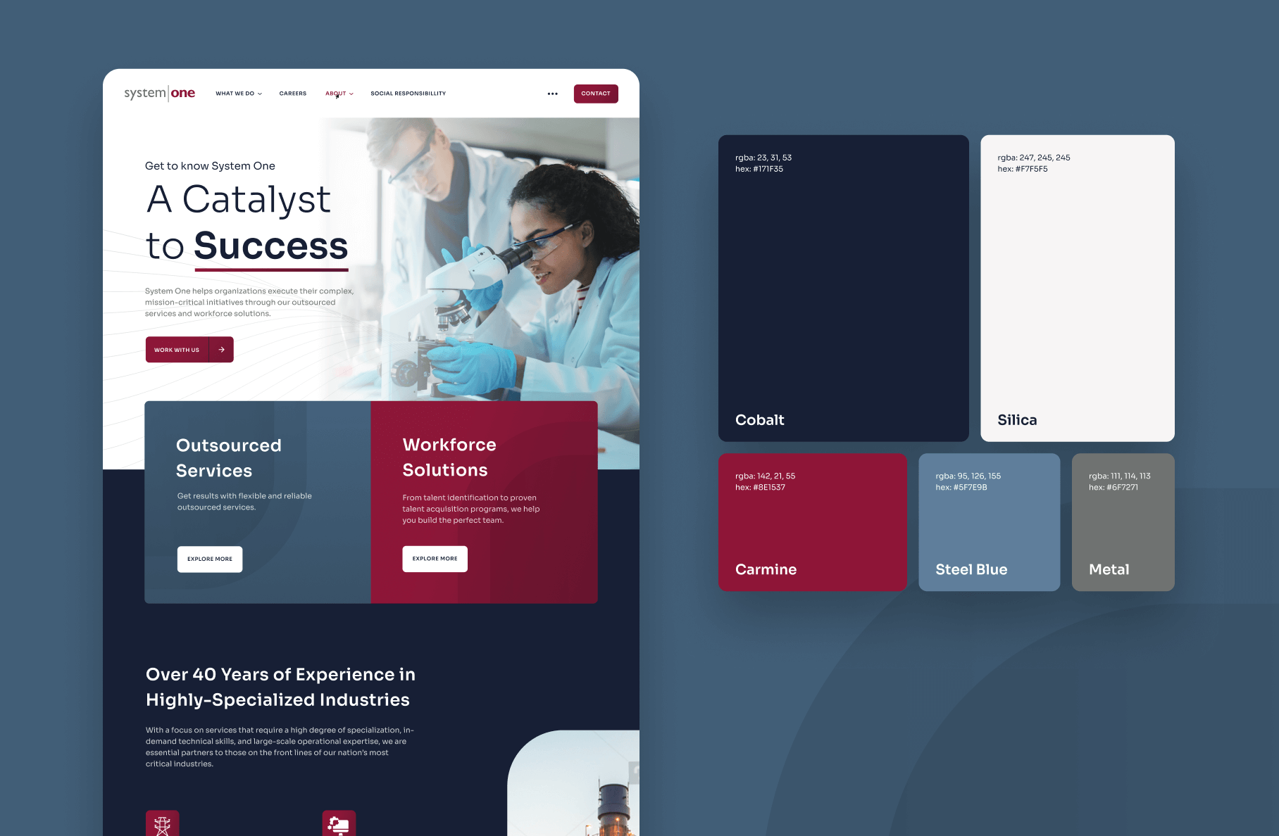
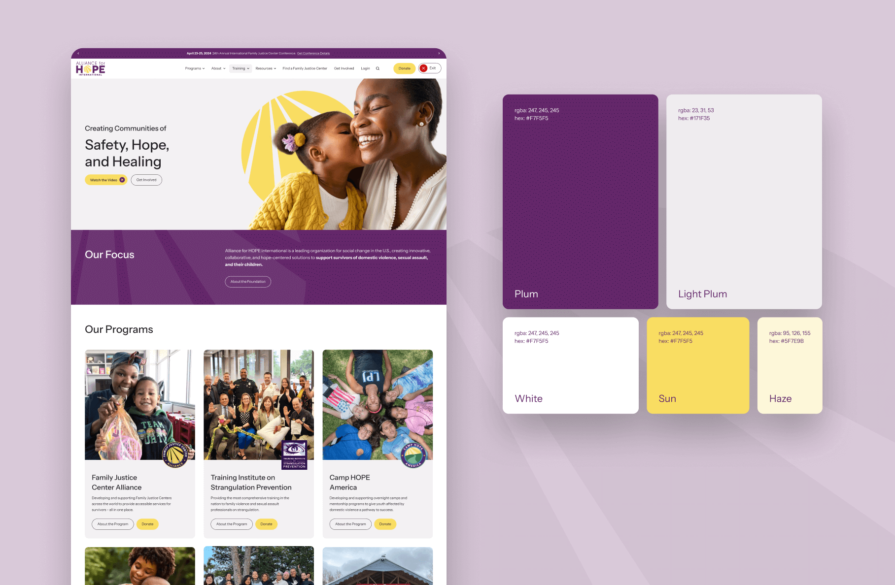
Assigning color roles is a great way to balance your color palette by limiting their usage. You should restrain your brand to one primary color whenever possible. This primary color will consist of the majority of your color usage.
Balance the primary color with some neutral colors, like a white or cream paired with a black. Then, if you’d like, add 1-3 secondary colors to add visual interest. The secondary colors should be used less often, almost like an accessory to the primary color. See a few examples of sites designed at By the Pixel with excellent color balance.
Accessibility in color palettes
It’s important in all designs to make sure your products are accessible. In other words, you want your products to be usable and understandable by as many people as possible. The WCAG (Web Content Accessibility Guidelines) is extremely helpful in laying out how to keep your designs accessible. Color is an integral part of these guidelines. If the colors on your site don’t have enough contrast between the foreground and background, the text won’t be readable.
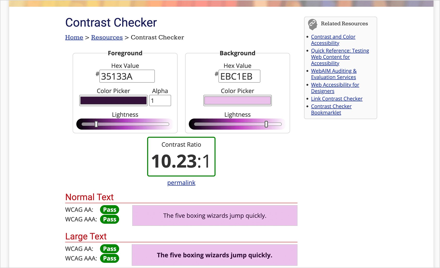
My favorite tool to use to make sure my colors are accessible is the “Contrast Checker” on WebAIM. You can input the hex color for the background and text color, and it will immediately tell you if it passes WCAG standards for legibility. You can then play with lightness sliders below each color to adjust them to be lighter or darker until they meet standards.
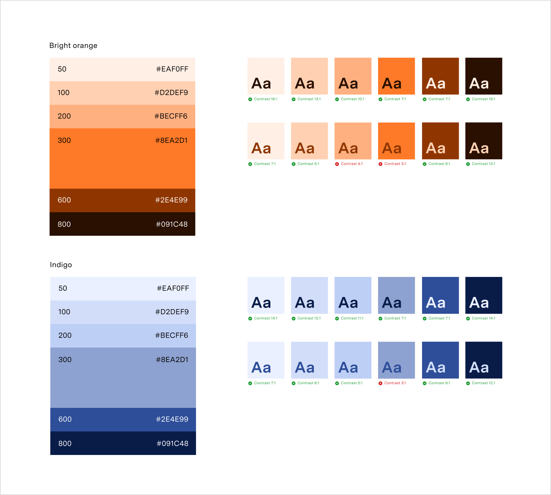
Having a range of tones within your brand’s color system is important to create accessible color combinations. Start with your base brand colors and add a set of dark and light tones from those colors.
I like to use the color system in Figma, use the HSL color model, and then use the lightness value to increment the color up or down. I use an equal spacing between tones by adjusting the lightness value up and down 10 or 20 points at a time and collecting each. Now you can combine the light tones with the dark tones to make accessible, on-brand designs.
It can be difficult to create a brand with colors, graphics, and typography to create an emotional connection with your users that is also usable and accessible. A trained designer can use their expertise to help you create a brand that performs. By the Pixel has an incredible team ready to help you bring your brand to life. Reach out and see what we can do for you.


