Philanthropy Colorado website
We redesigned Philanthropy Colorado’s website with bold visuals, straightforward navigation, and a scalable design system built for nonprofit impact.

About Philanthropy Colorado
Philanthropy Colorado is a 501(c)3 nonprofit membership organization that seeks to strengthen communities across Colorado by bringing people, information, and resources together. With over 120 member organizations, including foundations, corporations, and public agencies, Philanthropy Colorado helps shape Colorado’s philanthropic ecosystem.
As the organization grew, its website needs shifted and grew as well. To address the digital changes in their industry and better serve their growing community, Philanthropy Colorado called on us to help their website better represent their mission through more thoughtful web experiences.
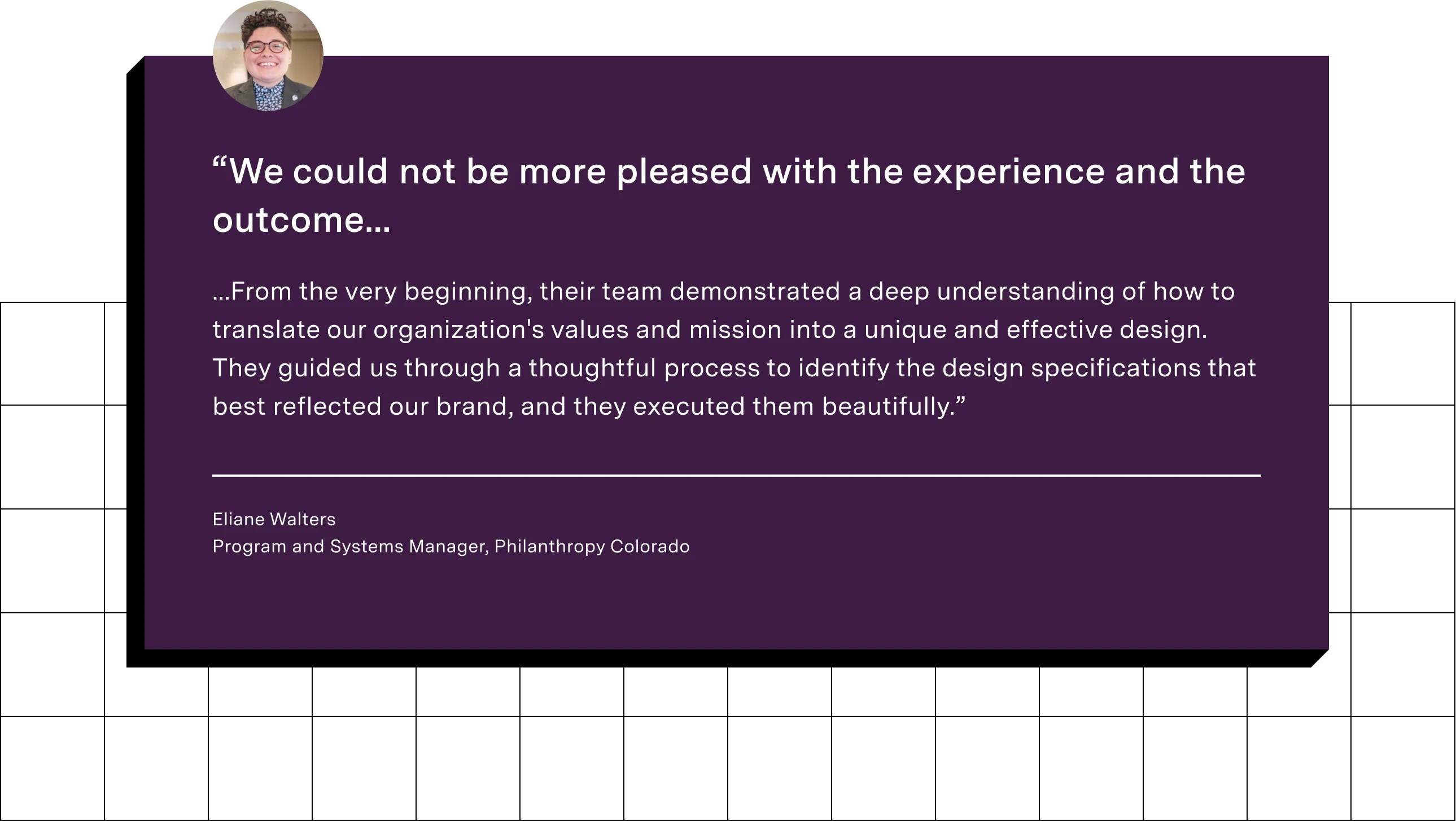
Deliverables
Wireframes
Mobile-responsive design system
Pixel-perfect high-fidelity designs
Design for clarity and connection
We began by researching Philanthropy Colorado’s users, including their members, funders, partners, and community. Extensive discovery sessions and user research revealed a few major friction points: confusing navigation, disorganized content, and some visual inconsistencies that made the site feel less welcoming than the client envisioned.
Combining extensive interviews and experience in web design, we were able to provide an updated and intuitive user experience. Users can now quickly find what they're looking for, whether that’s becoming a member, signing up for events, or digging into resources that support their work. Fewer clicks → more clarity → happier users.
Simplified, strategic information architecture
We started with a full content audit to reimagine the site’s information architecture. We also interviewed stakeholders to understand what users needed and where the structure fell short.
Then we streamlined everything into four main sections: “About,” “Membership,” “Engage,” and “News & Resources.” We kept the contextual sub-navigation that users loved, but modernized it to match the updated look and feel of the site. Overall, the site is now easier to explore, easier to manage, and way easier to get where you want to go.

Striking & cohesive brand identity
This redesign wasn’t just about making things look nice. It was about making the site feel like Philanthropy Colorado: Bold, modern, and full of energy, just like the organization itself. We started by closely examining their existing brand and then explored ways to translate that spirit into an engaging digital presence.
The new design is modern and professional, with vibrant colors, clean layouts, and confident typography. Blocks of yellow, purple, orange, and teal bring the Philanthropy Colorado brand front and center, while soft neutrals give each page a polished yet welcoming feel. High-contrast buttons, badges, and icons add personality without getting in the way. Best of all, the system is built to grow, poised to handle whatever stories, tools, or updates come next.

Unified content library
Instead of spreading blog posts, news, and resources across different corners of the site, we consolidated them into a single content library. It’s now a hub for all the latest and most helpful content Philanthropy Colorado offers.
With filtering, tagging, and clear categorization, users can now hone in on precisely what they need, whether it’s a timely policy update, recent news article, or downloadable guide. It’s easier to use, easier to maintain, and a much stronger representation of the organization’s thought leadership.

Development documentation done right
Even though we didn’t build the site ourselves, we made sure Philanthropy Colorado’s dev team had everything they needed to bring the designs to life. To facilitate development, we provided documentation, annotations, and design specs directly into our Figma files.
We covered everything from component behavior and responsive layouts to accessibility notes and styling guides. Thanks to a shared component library and easy-to-follow file structure, the handoff to development was smooth and straightforward.

The result
Philanthropy Colorado's fresh, modern website now reflects its real-life credibility, energy, and impact. It’s easier to navigate, more accessible, and built to grow with them. Most importantly, it feels like them, which is exactly what we set out to do.

