Most forms are built once and never revisited. They’re an afterthought, “something marketing wanted to track,” attached to a promotion, or a way to get the sales team the information they need to reach out. So the fields, layout, validation logic, styling, and messaging are all set and rarely questioned again, even as the rest of the site evolves.
But online forms offer subtle ways for businesses to demonstrate that they value their visitors and potential customers. This checklist covers decisions that determine whether a form respects the person filling it out or just gets in their way.
✅ Match field count to intent
Think of every field on a form as a tiny toll booth. At each booth, the visitor has to stop, think, and pay something (time, patience, or perhaps their willingness to keep going at all) before they can move on. Charge too many tolls, and people turn around or take a different highway.
Most forms rack up fields for reasons that have nothing to do with the visitor. Take this example: Someone in a marketing meeting six months ago said, "We might want to segment by company size later," so now “company size” is a required field on every form in perpetuity. With this in mind, before you add another field, it’s worth asking whether the information is vital.

✅Design for the input
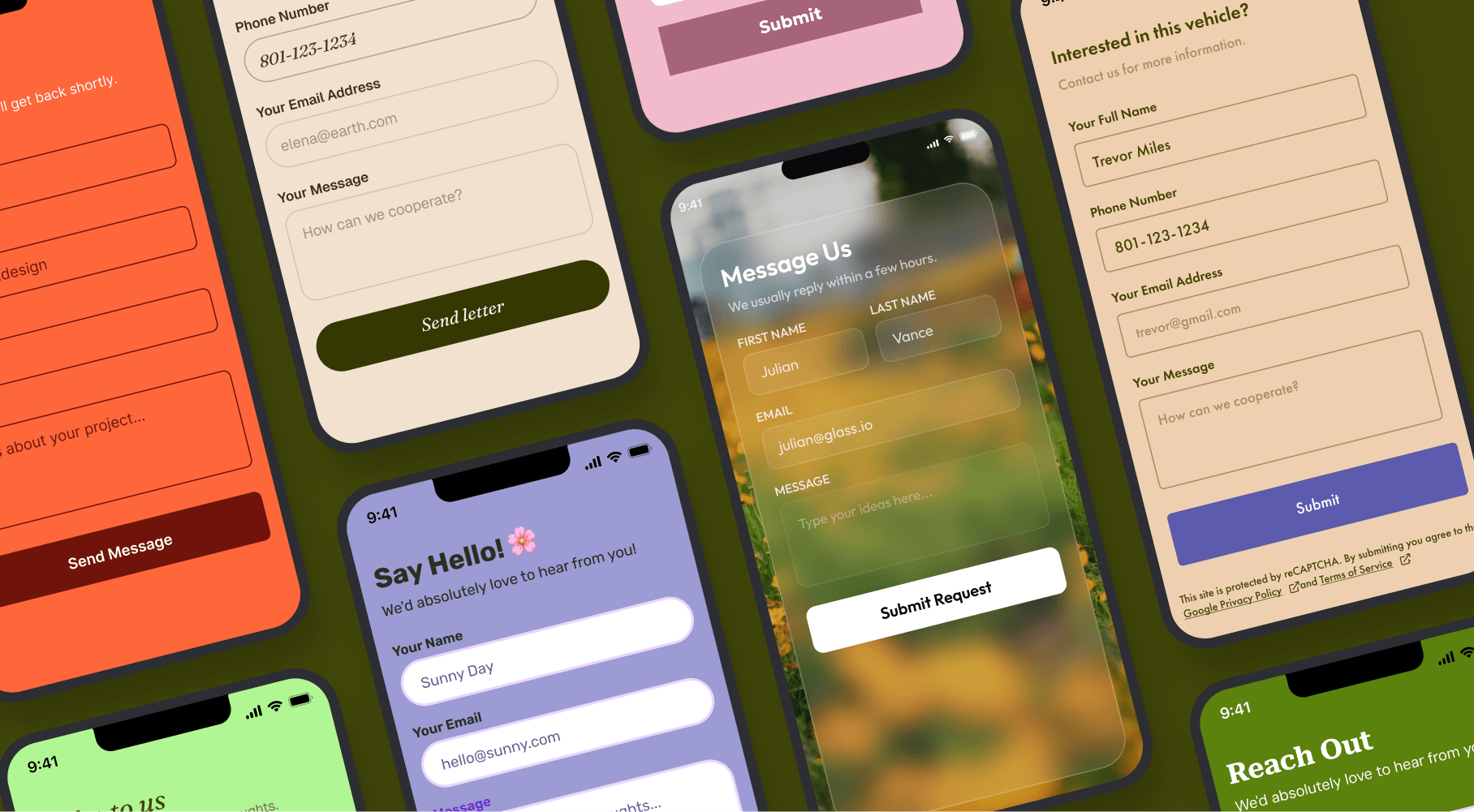
Here's an often-overlooked detail: a form field's underlying code can tell a phone which keyboard to display. So, if you mark a field as an “email input,” the phone provides a keyboard with the “@” symbol pre-populated. Mark it as a phone number, and up pops a number pad, saving your visitor from hunting across the alphabet and other keyboards.
When you skip this, every field defaults to a generic keyboard, so visitors have to switch manually between input types. It's a few extra taps each time, which sounds small until you remember it's happening to every mobile visitor, on every field, at every visit. And if you only test on a laptop, where a full keyboard is assumed, it’s easy to miss. But when you test it on a real phone, the gap shows up immediately.
✅Design mobile first, for real
That aforementioned gap doesn't stop at the keyboard, either. It's a pattern in which forms are designed and tested on a laptop, then squeezed onto a smaller screen and marked as finished. Tap targets sized for a mouse cursor become impossible to hit accurately with a thumb. Buttons tucked in a corner require a grip shift most people won't bother with.
And the only way to know for sure if any of this works is to have a person test it on a real phone, not eyeball a resized browser window and call it done.
✅Validate as you go
There's a special kind of frustration reserved for filling out a long form and hitting "submit" only to get hit with five error messages, as if the form waited on purpose to dump all the bad news at once. But that pile-up is avoidable if you use inline validation to catch problems one at a time as each field is addressed, rather than stockpiling them until the end.
Also, the same validation error can land in two completely different ways depending on how it's written. For example, an error like "invalid input" tells someone they've failed, but provides no guidance on why or what needs to be fixed. By contrast, tangible feedback like "please include an @ symbol" tells them exactly what to fix. This small difference makes the form (and the business behind it) feel like it’s on your side and not just grading you.
✅Don't punish interruptions
Nobody fills out a form in a quiet room with nothing else going on. They’re doing it in line at the pharmacy, half-watching a TV show on Netflix, on their work break, in the car during school pickup, and all of it right up until a phone call interrupts everything mid-sentence. A form that wipes out everything someone typed the second they get distracted punishes completely normal behavior, and it shouldn’t surprise anyone if no one comes back to finish.
Autosaving any progress, even the bare minimum, lets busy people pick up where they left off instead of starting over from scratch and deciding it's not worth the trouble after all. And, lucky for all of us, it’s built into many CMSes.
✅Say something back
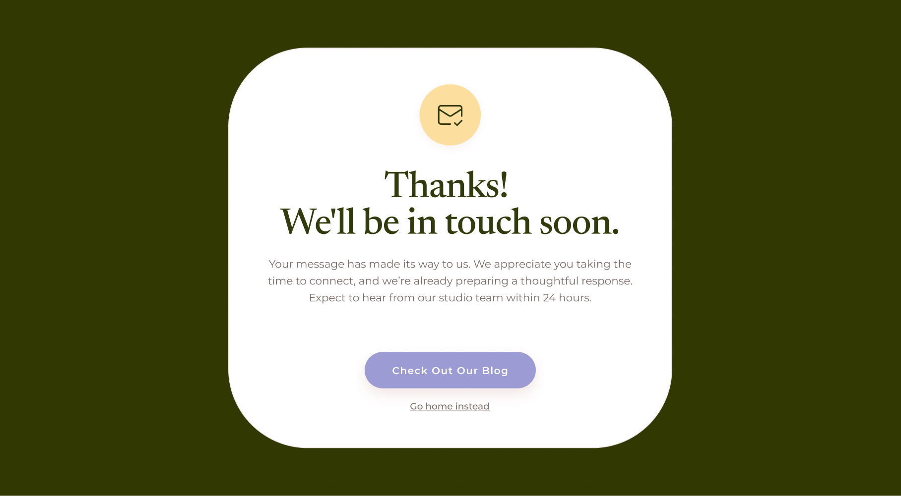
Submitting a form and getting nothing back but silence, or a generic "thank you" with zero information, is like sending a text and getting left on “sent” for hours. Did it go through? Should they expect a reply? From whom? By when? Nobody knows, so some people will just assume it didn’t work.
This is a copywriting job as much as a technical one. A clear confirmation that spells out what happens next and roughly when is the difference between "we've got this" and "who knows." All the inline validation in the world doesn't matter if the moment right after submission leaves someone wondering if they just screamed into a void.
✅Test on IRL devices
Emulators are fine for catching obviously broken layouts. They are not fine, however, for anything involving the way the thumb moves on a screen, how autofill behaves between iPhones and Androids, or what happens when the phone rotates mid-form. A browser window resized to look smaller is not a phone, so it won’t catch these nuances.
Testing on actual devices regularly, rather than once right before launch, catches the stuff that tanks completion rates while everyone assumes the form is fine because it looks fine in DevTools. This kind of process habit separates teams that actually build forms from those that just ship them on a hope and a prayer.
Forms are more than an afterthought
Cutting a field, fixing a keyboard type, writing a confirmation message that doesn't sound like a shrugging robot, testing on a device that isn't a laptop pretending to be a phone. These are small, specific, and entirely doable. But they might be easy to skip once the form is built and works well enough, which is why they sometimes go unrevised.
A form is a tiny fraction of a website, yet it can play a part in whether someone becomes a customer, subscriber, lead, or partner. Give it the same attention as the rest of the product, and watch it earn that attention back.